Showing posts with label OUAN405. Show all posts
Showing posts with label OUAN405. Show all posts
Tuesday, 21 January 2014
Process & Production: Pre Film
Thaumatrope: The Thaumatrope is an optical illusion toy, invented in the Victorian
times by either John Ayrton Paris or Peter Mark Roget. Both inventors
often get credited for its creation.
 Typically, it's made from a circular piece of card that has an image on
each side. For example; a bird on one side and a cage on the other.
Typically, it's made from a circular piece of card that has an image on
each side. For example; a bird on one side and a cage on the other.
It has string at each side of the card that is twisted to allow the card to spin around quickly once pulled, and when its spinning it displays the whole image, creating the illusion of the bird being in the cage.
 The reason behind seeing both of the images in one is because of 'persistence of
vision'. Persistence of vision is the delay between what
we see entering the eye and reaching the brain, leaving use to see both
images at once.
The reason behind seeing both of the images in one is because of 'persistence of
vision'. Persistence of vision is the delay between what
we see entering the eye and reaching the brain, leaving use to see both
images at once.
Flip Books: A flip book is a book with a series of pictures that vary gradually from one page to the next, so that when the pages are turned rapidly, the pictures appear to animate by simulating motion or some other change. The first flip book appeared in September 1868, when it was patented by John Barnes Linnett under the name kineograph. They were the first form of animation to employ a linear sequence of images rather than being spun in a circular way.

Magic Lantern: The magic lantern an early type of image projector developed in the 17th century and it was an early predecessor to the modern projector.

The Praxinoscope: The Praxinoscope is an improvement to the Zeotrope. It was invented in
1877 by Charles-Emile Reynaud. It worked a similar way to the Zeotrope by using a strip of images places inside a spinning
cylinder, but as opposed to using slits it worked through the use of
mirrors in the centre allowing the pictures to appear more still in
their position as the wheel turned. he viewer could look at the
reflection in the mirror rather then through the narrow strips as they
spun the wheel.
Typically, it's made from a circular piece of card that has an image on
each side. For example; a bird on one side and a cage on the other. It has string at each side of the card that is twisted to allow the card to spin around quickly once pulled, and when its spinning it displays the whole image, creating the illusion of the bird being in the cage.
 The reason behind seeing both of the images in one is because of 'persistence of
vision'. Persistence of vision is the delay between what
we see entering the eye and reaching the brain, leaving use to see both
images at once.
The reason behind seeing both of the images in one is because of 'persistence of
vision'. Persistence of vision is the delay between what
we see entering the eye and reaching the brain, leaving use to see both
images at once. Flip Books: A flip book is a book with a series of pictures that vary gradually from one page to the next, so that when the pages are turned rapidly, the pictures appear to animate by simulating motion or some other change. The first flip book appeared in September 1868, when it was patented by John Barnes Linnett under the name kineograph. They were the first form of animation to employ a linear sequence of images rather than being spun in a circular way.
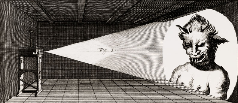
Magic Lantern: The magic lantern an early type of image projector developed in the 17th century and it was an early predecessor to the modern projector.
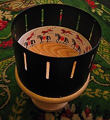
 The Zoetrope: The Zoetrope also known as the 'Wheel of Life' was another optical toy invented around 1833 by William Horner. It produces the illusion of motion from a rapid succession of static pictures from the use of slits cut vertically in the sides.
On the inner surface of the cylinder is a band with images from a set of
sequenced pictures. As the cylinder spins, the user looks through the
slits at the pictures across. The scanning of the slits keeps the
pictures from simply blurring together, and the user sees a rapid
succession of images, producing the illusion of motion.

The Praxinoscope: The Praxinoscope is an improvement to the Zeotrope. It was invented in
1877 by Charles-Emile Reynaud. It worked a similar way to the Zeotrope by using a strip of images places inside a spinning
cylinder, but as opposed to using slits it worked through the use of
mirrors in the centre allowing the pictures to appear more still in
their position as the wheel turned. he viewer could look at the
reflection in the mirror rather then through the narrow strips as they
spun the wheel.
Process & Production: Snow White and The Seven Dwarfs
Snow White and The Seven Dwarfs was Walt Disney's and the worlds first fully cel-animated feature length film and arguably one of the most techically influential films ever made.
Whilst others were skeptical on its success rate, Disney fought to get it finished and released despite taking a full 3 years to make (while some of that time was spent coming up with funding, and reworking ideas).
From this, many other Disney classics have sprouted from this adaptation of a fairytale leading to the huge franchise thats around today.
As a kid, I wasn't actually a fan of Snow White, I found it a bit creepy! But from re watching as I've been older I can really appreciate the effort that went into hand-drawing each and every one of the frames and the fact that it's a huge milestone in the development of modern animation.
Process & Production: Pixar Animation Studios
 In the early to mid 90's CGI was pretty uncommon. To have snippets of it in video games or films was seen as a huge novelty.
 But when Pixar released Toy Story in 1995, it really showed what the technology was capable of doing.
Pixar was previously known for it's 3D animated shorts such as Tin Toy and Luxo Jr. but once they'd created Toy Story - the first full length CGI feature film - they really set the standard high for animated films.
Next came Pixar's second CGI feature film 'A Bug's Life' in November 1998, and again, was very well received by its audience. But the release of A Bug's Life brought rivalry.
 During the production of A Bug's Life, a public feud erupted between DreamWorks' Jeffrey Katzenberg, and Pixar's Steve Jobs
& John Lasseter. Katzenberg, former chairman of Disney's film
division, had left the company in a bitter feud with CEO Michael Eisner.
In response, he formed DreamWorks with Steven Spielberg and David Geffen and planned to rival Disney in animation.
During the production of A Bug's Life, a public feud erupted between DreamWorks' Jeffrey Katzenberg, and Pixar's Steve Jobs
& John Lasseter. Katzenberg, former chairman of Disney's film
division, had left the company in a bitter feud with CEO Michael Eisner.
In response, he formed DreamWorks with Steven Spielberg and David Geffen and planned to rival Disney in animation. 
A Bug's Life was released less than two months after Dreamworks debut film 'Antz', which was seen as much more than a mere coincidence.
Both films feature the life of an individual ant who feels himself misfit in the
hive until he falls in love with the princess of the colony. He revolts against
the consistent oppression and brutality that prevailed in that colony and saves
the lives of his fellow-ants from evil raiders.
After building up a lot of publicity for A Bug's Life before its release and Dreamworks studio being virtually unknown, it was clear that Lasseter and Jobs believed that the idea was stolen by Katzenberg.
One difference that is apparent however is the animation and graphics. In Antz, the graphics designing isn't great, the surroundings appears
dismal and dark and that darkness really takes its toll on the animation. Whereas the landscape and the characters in A Bugs Life appear far more vibrant and perhaps is what led it to have a greater success.
Pixar have gone on and plan to make many more films making children and adults around the world appreciate the art of CGI animation.


Process & Production: 1930′s wartime Japanese cartoon
Having throughly enjoying Kenzō Masaoka's 'Spider and Tulip', I decided to keep having a look what other classic Japanese animations were suggested. This one in particular drew me to it straight away, purely for the title.
With the, what I assumed, unofficial title 'Evil Mickey attacks Japan' and its 1936 release year, I was intrigued to see what kind of wartime propaganda it was trying to portray.
From what I found out, it was released as propaganda to manipulate the Japanese public to be motivate the military forces to invade America and it's official title is "Toybox Series #3: Picture Book 1936" (a.k.a. Momotaro vs Mickey Mouse).
Mickey Mouse, a much famous and loved children's character from Disney, was used to portray the US army. This was clearly shown with him being accompanied by an army of crocodiles, snakes ect all having sharp, jagged teeth and sinister facial expressions - suggesting that they are the root of all evil, invading the peaceful island folk.
The islanders (represented by cats and dolls, for some reason) were attacked by Mickey's army until the hero Momotaro jumps out of a picture book, repels the Americans, and cherry trees blossom throughout the island as the grateful natives sing "Tokyo Chorus."
It's a really surreal animation, and I wish I could find out more about it.
From an animation point of view, it looks as though the animator Yoshitsugu Tanaka has used traditional style and pose to pose to create the characters movement.
Process & Production: Adobe Flash & Photoshop - Creating Simple Animation
To familarise us with using Photoshop and Flash as animating tools, we were asked to create a simple animation featuring a bouncing ball and pendulum.
Having never used Flash before, I was keen to give it a go as I was considering using it as my software for this project.
For some reason I didn't quite get the hand of it!
The pendulum swings far too fast and the ball bounces really slow! I have no idea why this happened by it was a only a quick task so I decided to keep them to document.
I did like the look of Flash from my brief time using it though! I thought the tween frames would be really useful to use one you got the hang of using them.
I will definitely be keen to learn Flash in the future, I think it gives a really nice animation effect from what I've seen of it.
But for this project I decided to use Photoshop as I was far more comfortable using it (contrary to the glitching pendulum).
 |
| Bouncing ball created in Flash |
For some reason I didn't quite get the hand of it!
The pendulum swings far too fast and the ball bounces really slow! I have no idea why this happened by it was a only a quick task so I decided to keep them to document.
 |
| Pendulum created in Flash |
I did like the look of Flash from my brief time using it though! I thought the tween frames would be really useful to use one you got the hang of using them.
I will definitely be keen to learn Flash in the future, I think it gives a really nice animation effect from what I've seen of it.
But for this project I decided to use Photoshop as I was far more comfortable using it (contrary to the glitching pendulum).
 |
| Pendulum created in Photoshop |
 |
| Bouncing ball created in Photoshop |
Process & Production: Finished Animation

It worked fine and the animation ran quite well (if not a little slow perhaps) and I was pretty pleased.

The water didn't look great, but due to time constraints I didn't really have the chance to
change it - this will be reflected on in my evaluation.
Once I had my animation completed, I began thinking about the audio.
I knew from the start that I wanted to use an instrumental version of Chris De Burgh's 'Lady in Red' for when the characters are dancing but I needed to record some voices for Horatio and general sounds. I didn't want any dialogue in the animation, I just wanted a couple of gasps and some splash effects so I made them myself using the voice recorder on my phone.

A couple of sound effects that I couldn't acquire myself (such as the sound of the waves and a distant seagull cry) I got from freesound.org.
When I had all my sounds together, I put everything into iMovie and began editing.
I didn't need any transitions or anything added to my animation so the editing process was pretty straight forward with just adding the audio and exporting.
 All in all, I think 'A Dream Is A Fish Your Heart Makes' (I added a name for the animation for the opening titles) has turned out OK. There's definitely room for improvement, but for a first digital animation experience I think it's an alright attempt!
Monday, 20 January 2014
Process & Production: Gertie The Dinosaur
In the process of creating Gertie, McCay required the help of one of his neighbours, John Fitzsimmons, who assisted McCay in tracing the backgrounds of an eye-watering ten thousand images onto rice paper and then mounted them onto cardboard to be processed and was the height of animation technology at the time.
Gertie The Dinosaur was a huge revolutionary change in the way animation was created.
Process & Production: Warner Brothers' Looney Tunes
These shorts were created by Warner Bros. from 1930 up until 1969 during the Golden Age of animation featuring the much loved Bugs Bunny, Daffy Duck, Porky Pig and others. They were broadcast worldwide so they were seen by a very wide audience and drummed up a vast fanbase.
Loony Tunes was created alongside Merrie Melodies and both occasionally featured a touch of adult humor in its comedic style which separated it from the other animated series such as Disney.
This allowed it to cater for a more mature audience, which has earned a place in many peoples heart to this day.
From this, many forms of merchandise and other media can be associated with the Looney Tunes short such as comic books, CDs, clothing, video games, feature films, advertisements, toys etc which has made it one of the most successful animated series ever created.
Sunday, 19 January 2014
Process & Production: Captain Pugwash
I know there's been a bit of controversy with the classic Captain Pugwash cartoons (I personally find it pretty funny) but I think their style of animation is really interesting!
Created by John Ryan from a comic strip, it was then adapted into a children's TV series, using cardboard cut-outs filmed in live-action (the first series was performed and broadcast live) and it was first shown on the BBC in 1957. I struggled to find a clip of the original series but managed to find a fair few from the later 70s version which was broadcast in colour. There was also another series shown in the late 90s which was created using traditional animation.
My personal preference is the series from the 70s. For some reason, I really like the jerky movements that the characters have from the use of cut out animation. I think the pastel colour pallet for the cut outs also work really well for the style of programme. I couldn't seem to find a clip of the waves but I really like the movement they have due to the cut outs! As creepy as I think the cartoon itself is, I really like this style of animation.
Process & Production: Kenzō Masaoka - Spider and Tulip
Being a fan of Japanese Anime, I decided to look into some of the early animations Japan had to offer.
Researching it, I was immediately pointed in the direction of an animation called Katsudō Shashin, an undated and private work by an unknown creator. This is claimed to be Japan's earliest animation, apparently created in 1917.
It is said to have used the cutout technique also used by Lotte Reiniger which I found interesting so I had a look for it on YouTube. I could only find tiny clips which weren't the originals so I decided not to document. But that's when I spotted this in the recommendation panel; Spider and Tulip by Kenzō Masaoka. With it being 15 minutes long, I thought I'd only watch a couple of minutes to get the gist of it, but I found myself watching all of it - its so charming! It's a bit older than Shashin's animation with it being made in 1943 but it shows how much animation had improved technically over a couple of decades.
Using the cell technique to create this, Masaoka shows how characters can move so much more fluidly by using cells and the details on the spider's webs and flowers in this make the animation feel all that more clean and together. The scene where its raining really stands out for me - I think it's done with a great deal of attention to detail, so much so that it makes me as a viewer feel chilly watching it. Plus when he's flying amongst the flowers, I think it really give a sense of depth.
I'm really glad to stumbled upon this animation, I'm going to look into Masaoka's work more.
Process & Production: Lotte Reiniger - The Adventures of Prince Achmed
Here is a clip from the classic animated film The Adventures of Prince Achmed by Lotte Reiniger - being one of the first animated film to be made and not lost. I watched this on recommendation from a friend before knowing how old it actually was and I thought it was really impressive. I guessed it was from around the 1940s but when I did a little research into it and found out it was made two decades earlier I was mind-blown. This was made in 1926 when animated filmmaking was very limited.
I think the film is beautiful; the animation is phantasmagoric and the score really brings it all together. It features a silhouette animation technique Lotte had invented herself which involved manipulated cutouts made from cardboard and thin sheets of lead under a camera taking from 1923 to 1926 to make.
I'm amazed at the many details she put into this - take that moment when the witch-master looks at himself in the mirror. It's just a tiny detail, but it brings so much to the character. I think the fact that it is in colour shows how much effort went into making the film. Lotte would have used the very early method of color tinting, where they photograph it in black-and-white and then paint the color directly onto the film with dye. I can image every frame would have been painstakingly made but all the effort gone into this has made an animation that will forever go down in history.
Thursday, 9 January 2014
Process & Production: Progress so far - 9/1/2014
So far, I'm about 2-3 seconds into my animation (after scrapping it once). I'm currently using a software called Paint Tool SAI to illustrate my frames and them place them into a Photoshop animation. I have learnt however that this is pretty time consuming but for the minute it's the software I'm most comfortable drawing with as I'm not 100% confident in using Photoshop for illustrating.
After doing a quick animatic to show how the animation would pan out, I began work on my final using SAI.
 I really enjoy using this software as it has tools which enables you to easily edit images. I'm sure Photoshop has a similar feature which I have not yet discovered.
I do plan to increase my skills with Photoshop though as I understand it is primarily what they use in industry.
I think my animation is going alright so far. I do have to knuckle down and get about 2-3 seconds done each day to ensure that it is done in time for deadline.

I definitely need to revise my Photoshop skills. I know the basics, but I'm finding the whole animation interface quite confusing at times. I'm sure I'll pick it up more as I go along. It is my first time using it as an animation tool after all.
After doing a quick animatic to show how the animation would pan out, I began work on my final using SAI.
I do plan to increase my skills with Photoshop though as I understand it is primarily what they use in industry.
I think my animation is going alright so far. I do have to knuckle down and get about 2-3 seconds done each day to ensure that it is done in time for deadline.
I definitely need to revise my Photoshop skills. I know the basics, but I'm finding the whole animation interface quite confusing at times. I'm sure I'll pick it up more as I go along. It is my first time using it as an animation tool after all.
Tuesday, 7 January 2014
Process & Production - The Four Elements
I've decided to take a massive U-turn on my project and go with my idea for the water element.
 I've
done this as I'd lost enthusiasm with my fire idea - I thought it was
too cheesy (not in a good way) and predictable. Whenever I was working
on it I kept thinking I wish I'd have gone with the seagull and fish love
story. Therefore, over Xmas I began working on my second attempt.
I've
done this as I'd lost enthusiasm with my fire idea - I thought it was
too cheesy (not in a good way) and predictable. Whenever I was working
on it I kept thinking I wish I'd have gone with the seagull and fish love
story. Therefore, over Xmas I began working on my second attempt.
I started by drafting some initial character design. I played with the idea of having the characters in a realistic style but again, I wanted to have my animation cartoony with a lack of any major detail. Not because I'm lazy or anything! I just like really linear, crisp styles of animation.
I sketched a couple more styles of fish and seagull before I decided on a final outcome.


 Here is the final design for the main characters of my animation. I've decided to name them Horatio (Seagull) and Martell (Fish) just so it's easier when it comes to storyboarding and understanding who's who.
Horatio's facial expressions are heavily influenced by Mordecai from Regular Show. At the beginning of the story, he always seems to look moody with a lack of enthusiasm. His character softens when he meets Martell.
I can't really think of where I got the idea for Martell's design. I knew I wanted her to have a soft facial features with glowing cheeks but as for her face itself, I guess I just thought of it whilst sketching. Her movement in the animation is inspired by the Pokemon 'Goldeen'. Its seen in the game and the anime as quite a pretty fish that gracefully floats in the water. I want to achieve this kind of effect when animating the meeting scene. I justified scrapping my last idea by saying it was 'too cheesy and not in a good way' yet I want an instrumental of Chris De Burgh's 'Lady in Red' to play when their eyes meet. I guess I'm just drawn to cheesiness - this time it's definitely in a good way... hopefully.


I've also been having a look at how seagulls fly to get a realistic effect for when I'm animating Horatio. On this, they seem to be gliding more than flying and thinking about it, I've only ever really seen them glide. I'll probably making the first scene in my animation windy so that my seagull can glide.
I've
done this as I'd lost enthusiasm with my fire idea - I thought it was
too cheesy (not in a good way) and predictable. Whenever I was working
on it I kept thinking I wish I'd have gone with the seagull and fish love
story. Therefore, over Xmas I began working on my second attempt. I started by drafting some initial character design. I played with the idea of having the characters in a realistic style but again, I wanted to have my animation cartoony with a lack of any major detail. Not because I'm lazy or anything! I just like really linear, crisp styles of animation.
I sketched a couple more styles of fish and seagull before I decided on a final outcome.
Horatio's facial expressions are heavily influenced by Mordecai from Regular Show. At the beginning of the story, he always seems to look moody with a lack of enthusiasm. His character softens when he meets Martell.
I can't really think of where I got the idea for Martell's design. I knew I wanted her to have a soft facial features with glowing cheeks but as for her face itself, I guess I just thought of it whilst sketching. Her movement in the animation is inspired by the Pokemon 'Goldeen'. Its seen in the game and the anime as quite a pretty fish that gracefully floats in the water. I want to achieve this kind of effect when animating the meeting scene. I justified scrapping my last idea by saying it was 'too cheesy and not in a good way' yet I want an instrumental of Chris De Burgh's 'Lady in Red' to play when their eyes meet. I guess I'm just drawn to cheesiness - this time it's definitely in a good way... hopefully.
 |
| Quick storyboard |
I've also been having a look at how seagulls fly to get a realistic effect for when I'm animating Horatio. On this, they seem to be gliding more than flying and thinking about it, I've only ever really seen them glide. I'll probably making the first scene in my animation windy so that my seagull can glide.
Animation: Process & Production - Inspiration
When I thought of using fire as my element, I immediately knew I wanted to tell a story involving humanised fire characters.
From this, I looked into different animations which have also featured fire that has come to life.
First of all, I began looking at the Fire Princess from Adventure Time and her characteristics. Not really being a fan of the show, I hadn't seen much of her. I had a look online to see how her flames move and how the make it really obvious she's made of fire (apart from knowing her name).
I saw this clip on YouTube and I really liked the fluidity of the movement of her flames. Like my characters, she has mostly human features but it also clear she is made of fire. I'd like to try my luck at getting a similar fire effect into my animation.
I also looked at the way Calcifer (the fire demon) from Howl's Moving Castle moved. The videos pretty low quality as I couldn't find a clip just featuring him but it shows how the Ghibli animators have captured the movements of a real open fire. I think it would be a nice touch to have my characters flames be like this but it'll probably be quite time consuming.
Looking at real-life fire clips has also been useful in grasping the ways fire moves, but I'm not really keen on the idea of having my animation realistic (as the story itself isn't!).
I recently had a crit on my work, showing my initial ideas, my animatic and where I am with my project. I don't really know how the idea went down as a whole. Some people seemed to quite like it whereas others looked a bit blank. It was the reaction I was expecting as I, myself aren't 100% on the idea unfortunately. I didn't receive much feedback, just in future do an animatic in the correct way (I did gifs and put them into a powerpoint, probably couldn't have done it more wrong if I tried) and perhaps make the characters flames move - which I intend to do anyway. I like the idea of having crits however - I think the constructive criticism helps you identify things in your work that perhaps you didn't even notice.
Sunday, 29 December 2013
Process & Production - The Four Elements
In the new brief we've been assigned, we've been asked to create a 20 second digital animation which tells a story about one of the four elements - Earth, Air, Fire & Water. The animation is to be created on either Adobe Flash or Photoshop.
After thinking about some ideas when doing a mind map, I was torn between two; A seagull that fell in love with a fish (for water) or a fire person who struggles with confidence.


Here is a quick storyboard for the animation:

After thinking about some ideas when doing a mind map, I was torn between two; A seagull that fell in love with a fish (for water) or a fire person who struggles with confidence.
I liked the idea of humanising fire - giving them bodies and personalities so I decided to go with my second idea.
I sketched some quick character design sketches and refined them digitally.
I like the way they've turned out. It's only a start but I think you can sort of pick up on their personalities.
I've decided to use Photoshop to create my animation as it's what I'm more familiar with at the minute.
Here is a quick storyboard for the animation:
Subscribe to:
Comments (Atom)